How Images and Media Cause Layout Shift (and How to Fix It)
The complete guide to preventing CLS from images, videos, iframes, responsive images, and media embeds

How Images and Media Cause Layout Shift (and How to Fix It)
The 2025 Web Almanac puts a number on what I keep seeing in the field: 62% of mobile pages have at least one image without explicit width and height. That makes unsized media the number one cause of Cumulative Layout Shift on the web. And every one of these shifts is preventable with techniques that have existed since 2019.
Last reviewed by Arjen Karel on March 2026
Table of Contents!
- How Images and Media Cause Layout Shift (and How to Fix It)
- The browser does not know how big your image is
- How width and height prevent layout shift
- Things that undo the fix
- When CSS aspect-ratio is the better choice
- Videos, iframes, and SVGs
- Responsive images
- Fixed containers, carousels, and containment
- How to find image CLS
- Quick CLS fix checklist
- Where the web stands on image CLS
- Related guides
- Image and Media CLS Questions Answered
The browser does not know how big your image is
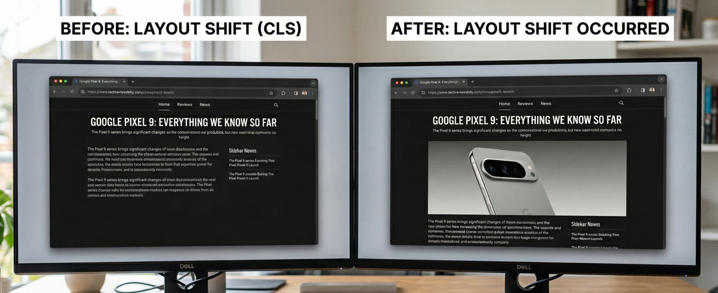
Every layout shift caused by an image comes down to one thing. The browser does not know how much space to reserve before the image loads.
When the browser encounters an <img> tag without dimensions, it does not stop until it knows the image dimensions. No it just reserves a space of 0x0 pixels. Then image is downloaded, the browser recalculates the layout and everything below the image jumps down. That jump is your CLS.
How width and height prevent layout shift
The only fix for a layout shift is to reserve the right space. The easiest way to do that is to just set the right (intrinsic) width and height of the image. In 2019 and 2020 all major browsers shipped a feature that changed how width and height attributes work. Browsers now use them to calculate an aspect ratio before the image downloads.
When you write this:
<img src="hero.jpg" width="800" height="450" alt="Description">
The browser internally generates this:
img[Attributes Style] {
    aspect-ratio: auto 800 / 450;
}
For responsive images, add this CSS:
img {
    height: auto;
    max-width: 100%;
}
Browsers don't need to download the full image file to calculate dimensions. The browser knows the ratio and reserves the vertical space. The CSS does the final part: containment. height: auto calculates the height from the ratio. max-width: 100% prevents the image from exceeding its container.
Things that undo the fix
Width and height attributes are all you need to prevent images causing layout shifts. But there are still a few common patterns that undo the work and make images cause layout shifts even with dimensions and CSS.
width:auto in CSS
This is the one I see the most and the one that wastes the most debugging time. The developer sets width and height on every image, does everything right in the HTML but somewhere in the CSS file there is an extra width:auto for images.
img {
    width: auto;
    height: auto;
    max-width: 100%;
}
The problem is width: auto. Because the browser's internal ratio has the lowest CSS priority, any rule overrides it. width: auto removes the width the browser was using to calculate the height. Both dimensions become unknown. The image renders at 0x0 until the file downloads and the final dimensions are known.
Setting aspect-ratio in CSS does not fix this. With width: auto, the browser initially treats the width as 0. An aspect ratio calculated from 0 still produces 0x0.
What makes this one hard to catch is browser caching. If the image is in the browser cache, the actual dimensions are available immediately and no shift occurs. I have debugged this on dozens of client sites and it was always cached on the developer's machine.
The fix:
img {
    height: auto;
    max-width: 100%;
}
Remove width: auto. Keep height: auto and max-width: 100%. This is the pattern recommended by web.dev.
Quick check: right-click any image, inspect it, look at the computed styles. If you see width: auto, that is your problem. For the complete walkthrough, see fix layout shift caused by auto-sizing images.
Wrong image dimensions
Remember the internally generated aspect ratio? This is where things get a bit technical. The auto keyword tells the browser: use this ratio as a placeholder, but once the actual image loads, switch to the real dimensions. If you set wrong values (width="4" height="3" on a 16:9 image), the browser reserves 4:3 space initially, then corrects to 16:9 when the image loads. That correction is a layout shift. Always use the actual pixel dimensions of the image.
When CSS aspect-ratio is the better choice
Width/height attributes are the default approach and always the best approach but sometimes your CMS won't let you add image dimensions (and that happens more than you think!). In that case you can control how much space is reserved by using the CSS aspect ratio. For example if your hero image has the .hero class you can reserve its space like this:
img.hero {
    aspect-ratio: 16 / 9;
    width: 100%;
}
Works in all modern browsers (Chrome 88+, Firefox 87+, Safari 15+) and on any element, not just images and videos.
Videos, iframes, and SVGs
Videos
Same problem, same fix. Set width and height to match the video resolution:
<video src="demo.mp4" width="1280" height="720" autoplay muted loop></video>
Add height: auto; max-width: 100%; in CSS. One thing to watch: set the dimensions to match the video resolution, not the poster image. If they differ, you get a shift when playback starts.
Iframes
Unlike images, iframes do not calculate an aspect ratio from their attributes. Without explicit dimensions they default to 300x150 pixels. For most embeds that is wrong. For iframes it is best to set the aspect-ratio like this:
.responsive-iframe {
    width: 100%;
    height: auto;
    aspect-ratio: 16 / 9;
}
Better yet, do not load the iframe at all. For YouTube, Vimeo, Google Maps, and social embeds I stopped loading iframes on page load years ago. Show a static placeholder image with the correct aspect ratio. When the iframe becomes visible, JavaScript swaps it with the real iframe. The shift from the swap happens within 500ms of user input and is excluded from CLS by design.
For implementation details, see perfect YouTube embeds and Google Maps without losing PageSpeed.
SVGs
SVGs loaded via <img> need width and height on the tag, same as raster images. Inline <svg> elements need a viewBox with CSS aspect-ratio. Without either they default to 300x150.
Responsive images
Keep the same ratio across all srcset sources
All images in a srcset must share the same aspect ratio. If they do, one set of width/height on the <img> is enough:
<img
    src="hero-800.jpg"
    srcset="hero-400.jpg 400w, hero-800.jpg 800w, hero-1200.jpg 1200w"
    sizes="(max-width: 600px) 100vw, 800px"
    width="800" height="450"
    alt="Hero image">
800:450 is the same ratio across all three variants. No matter which one the browser picks, the reserved space is correct. If you need different ratios, use <picture> with <source> elements instead.
Art direction: different ratios per breakpoint
When you serve different crops at different viewport widths you will need to use the <picture> element. Set width and height on each <source>:
<picture>
    <source
        media="(max-width: 799px)"
        srcset="hero-mobile.jpg"
        width="480" height="600">
    <source
        media="(min-width: 800px)"
        srcset="hero-desktop.jpg"
        width="1200" height="400">
    <img
        src="hero-desktop.jpg"
        width="1200" height="400"
        alt="Product hero image">
</picture>
Chrome and Safari pick up the correct dimensions from whichever <source> is active. Firefox does not (bug 1694741). It always uses the <img> fallback dimensions. Workaround: match the breakpoints with CSS media queries.
picture img {
    width: 100%;
    height: auto;
}
@media (max-width: 799px) {
    picture img {
        aspect-ratio: 480 / 600;
    }
}
@media (min-width: 800px) {
    picture img {
        aspect-ratio: 1200 / 400;
    }
}
If all your crops share the same ratio, the Firefox bug does not matter.
Fixed containers, carousels, and containment
object-fit for fixed size containers
Product card grids where every card is the same height but images have different ratios. Lock the container, let the image fill it:
.product-image {
    width: 100%;
    aspect-ratio: 1 / 1;
    object-fit: cover;
    object-position: center;
}
<img
    src="product.jpg"
    width="400" height="600"
    class="product-image"
    alt="Product name">
The size is locked before the image loads. This also replaces CSS background images. Background images cannot be lazy loaded, the preload scanner does not find them, and you cannot use fetchpriority. An <img> with object-fit: cover gives you all those controls.
Carousels
Slide transitions that animate left, width, or margin trigger layout recalculation. Because autoplay is not user input, every shift counts toward CLS. Fix the container with a fixed aspect ratio. Animate with transform: translateX() instead. Transforms run on the GPU and never trigger layout.
Containment for embeds you cannot control
Ad slots, third-party widgets, user-generated content. You don't control what they render and you can't clip them. The realistic goal is to minimize the shift, not eliminate it.
Start by reserving space:
.ad-slot {
    min-height: 250px;
    contain: layout style;
}
The min-height handles the big win. If the ad loads at 250px or less, no shift. If it loads at 300px, you get a 50px shift instead of a 300px shift from zero. That difference matters.
contain: layout does something different. It does not stop the container from growing. It isolates what happens inside. When the ad network injects scripts that reflow their own content (resizing iframes, injecting new elements, recalculating internal layout), those recalculations stay inside the container. Without containment, every internal reflow in the ad triggers a layout recalculation for the entire page. With it, the browser skips everything outside the box. That makes the page more responsive while ads are loading.
contain: style prevents CSS counters and other style side effects from leaking out. Cheap insurance.
For the min-height value, check your ad provider's most common creative sizes and pick the one that covers the majority of impressions. If 90% of your ads are 250px and 10% are 300px, set it to 250px and accept the occasional small shift. Setting it to 300px means 90% of page loads have 50px of empty space collapsing when a smaller ad loads. That collapse is also a layout shift.
There is no perfect answer for ads. The goal is the smallest possible shift across the most page loads.
How to find image CLS
You will not catch image CLS under normal browsing conditions. Your browser cache already has the dimensions from a previous visit so the shift never happens. To see what your real users see, open DevTools (F12), go to the Network tab, and check "Disable cache". The cache is only disabled while DevTools is open. Alternatively, use an incognito window.
Real User Monitoring
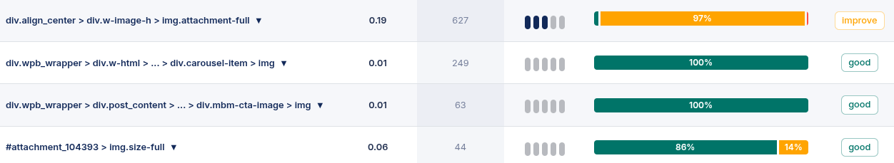
Start with CoreDash or another RUM tool. CLS attribution data shows exactly which elements shifted. Navigate to CLS, look at the attribution Element table. Filter for image and you get every image element affected by layout shifts, ordered by impact.
Chrome DevTools
Disable the cache in the Network tab, throttle to Slow 4G, enable screenshots, reload. Watch for visual jumps. Then open the Performance panel and look for "Layout Shift" entries. Click a shift to see the node, the score, and whether it had recent user input.
Core Web Vitals Visualizer
The Core Web Vitals Visualizer extension highlights every layout shift with a colored overlay. I use this as my first step before opening the Performance panel. Reload with the extension active and you see exactly what moved.
Quick CLS fix checklist
| Element | CLS cause | Fix |
|---|---|---|
<img> |
Missing width/height | Add width and height; use height: auto; max-width: 100%; in CSS |
<img> |
CSS width: auto overriding dimensions |
Remove width: auto; keep only height: auto |
<img> |
Wrong width/height values | Use the actual pixel dimensions of the image |
<video> |
Missing width/height | Add width and height matching the video resolution |
<iframe> |
Default 300x150 | CSS aspect-ratio: 16 / 9; width: 100%; or the facade pattern |
<picture> |
Different ratios per source (Firefox bug) | Set width/height on each <source>; add CSS media query fallback |
<img srcset> |
Mixed ratios in srcset | Same ratio for all sources; set width/height on the <img> |
| JS lazy loading | 1x1 placeholder with wrong ratio | Use native loading="lazy" or match placeholder ratio |
| Carousel | Autoplay + layout-triggering transitions | Fixed aspect-ratio container; transform for transitions |
| SVG | No built-in dimensions | Width/height on <img> or viewBox + CSS aspect-ratio |
| Ad slots / embeds | Unknown dimensions | min-height + contain: layout style |
Where the web stands on image CLS
The 2025 Web Almanac numbers:
- 62% of mobile pages have at least one unsized image. Down from 66% in 2024. Still the majority.
- 65% of desktop pages have unsized images. Down from 69%.
- At the p75, a desktop page has 9 unsized images. Mobile has 8.
- Median unsized image height: 111px on desktop, 98px on mobile. Enough to shift a paragraph.
- 72% of desktop and 81% of mobile origins pass CLS. Up from 62% in 2021.
CLS has improved more than any other Core Web Vital over the past four years. Unsized images are still the biggest contributor. Fix this one issue and layout shifts disappear on most sites.
Related guides
- What is Cumulative Layout Shift (CLS): The complete guide. Formula, thresholds, session windows, and all CLS causes beyond images.
- Find and Fix CLS Issues: Step-by-step diagnostics with RUM data, DevTools, and fixes for every cause.
- Fix layout shift caused by auto-sizing images: The full
width: autowalkthrough. - Optimize images for Core Web Vitals: Preloading, responsive images, formats, prioritization.
- Layout shift caused by CSS transitions: How layout-triggering animations cause CLS.
- Perfect YouTube embeds: The facade pattern for zero CLS.
- Google Maps 100% PageSpeed: Same facade approach for Maps.
CoreDash has MCP built in.
Connect it to Claude or any AI agent. Ask it why your INP spiked last Tuesday.
See how it worksImage and Media CLS Questions Answered
Why does width:auto on images cause layout shift even when width and height attributes are set?
The browser's internal aspect ratio from width/height attributes has the lowest CSS priority. width: auto overrides it, making both dimensions unknown. The image renders at 0x0 until the file downloads. Remove width: auto and keep only height: auto; max-width: 100%;.
Do I need width and height on video and iframe elements too?
Yes for video. Same mechanism. Iframes are different: they do not calculate a ratio from attributes and default to 300x150. Use CSS aspect-ratio or the facade pattern.
How do I prevent CLS with the picture element when aspect ratios differ per breakpoint?
Set width and height on each <source>. Chrome and Safari use the correct dimensions. Firefox has a bug where it always uses the <img> fallback. Add CSS media queries with the correct aspect-ratio per breakpoint as a workaround.
Does lazy loading cause layout shift?
Not if the image has width and height attributes. But lazy loading above-the-fold images delays LCP for no benefit. Never use loading="lazy" on images in the initial viewport.
Why does Lighthouse show good CLS but my field data shows layout shifts?
Lighthouse runs on a warm browser with fast network. It does not catch the width: auto problem because it checks HTML attributes, not computed CSS styles. Always verify CLS with field data from CrUX or a RUM tool like CoreDash.

