Optimize the Largest Contentful Paint Image
A step by step LCP Image Optimization guide

Optimize the Largest Contentful Paint Image
This guide is part of the Largest Contentful Paint (LCP) hub. On most websites, the LCP element is an image. Get the image wrong and your LCP score suffers. This article covers every technique to make it fast.
According to Google only 65% of all the pageviews on the internet (and that includes desktop as well as mobile) have a 'good' Largest Contentful Paint Score. That means 35% of the pageviews are failing and that is in part because of mistakes made with images. This article breaks down common good practice patterns and mistakes when images become the Largest Contentful Paint element.
LCP tip: If you really want to master all the nuances of the Largest Contentful Paint and not just the Image optimization part, check out my Largest Contentful Paint section. It breaks down how to optimize the four key components:
- Time to First Byte: The time the browser needs to wait for the HTML. This usually mostly consists of waiting for the server but also includes redirects, connection time, encryption, and more.
- Load Delay: The gap between when the LCP element could have started loading and when it actually does. Read the full guide on Resource Load Delay.
- Resource Load Time: The time it takes for the LCP resource to load. Optimizing compression and minification can speed this up. Read the full guide on Resource Load Duration.
- Render Delay: Even with optimized resources, the browser might be tied up with other tasks (usually downloading stylesheets or heavy JavaScript processing), delaying the LCP rendering. Read the full guide on Element Render Delay.
While all these factors matter, if your LCP element is an image (and it frequently is!), there are simple steps you can take to make sure it loads as fast as possible!
Table of Contents!
- Optimize the Largest Contentful Paint Image
- Experiments with the Largest Contentful Paint
- 1. Control the LCP Candidate: The Text-First Strategy
- 2. Use the Fastest Image Format Available
- 3. Use Responsive Images
- 4. Scale Your Images to the Screen Size!
- 5. Use Eager Loaded LCP Images
- 6. Preload the LCP Image
- 7. Remove Fade-In Animations from the LCP Image
- 8. Self-Host the LCP Element
- 9. Avoid Client-Side Rendering for the LCP Element
- 10. Reserve Space to Prevent Layout Shifts
- 11. Audit for Main-Thread Blocking
- Related LCP Optimization Guides
Experiments with the Largest Contentful Paint
I always say: listen and learn but don't take anyone's word for it. There are too many 'gurus' out there preaching wrong information. That is why I have created a fully automatic LCP experiment where you can check out for yourself what happens when the LCP element is not loaded optimally. Check out my LCP Test on github or try the live demo!
It will automatically test multiple LCP scenarios for you and show you the results. I will discuss those scenarios below and explain how and why it will speed up or slow down the LCP image element.
1. Control the LCP Candidate: The Text-First Strategy
The fastest way to improve your image-based Largest Contentful Paint? Don't use an image! Wait, what? Yep, you heard me right. Let me explain.
Why Text is Faster Than an Image. The performance difference comes down to the request pipeline. A text node (like an <h1> or <p>) is part of the main HTML document. It has no separate resource request; its rendering is only blocked by CSS. An image, on the other hand, is an external resource that requires its own HTTP request. This introduces network latency (DNS, TCP, TLS, and download time) on top of being blocked by CSS. This distinction is the core reason for the performance difference and why controlling the LCP candidate is a powerful, expert-level strategy.
So what's the case for images versus text? Images are important; they make your site visually appealing. But Core Web Vitals does not care which element becomes the LCP. When the LCP element is a text-based element it usually co-occurs with the First Contentful Paint.
So should you switch to a text-based Largest Contentful Paint element? That depends! Images matter and they make your site visually appealing. That means you will not hear me advocate for switching to old boring text elements. But mistakes also happen! I wish I had a dollar for every category page that fell victim to the "Accidental LCP" anti-pattern. This is where a page "forgets" to add a descriptive category text above the fold, causing a lazy-loaded product image to become the LCP and delaying load times by seconds. This often happens when designers place a large hero banner at the very top of the DOM, before any significant headlines, leaving the browser with no choice but to select a slower LCP candidate.
2. Use the Fastest Image Format Available
Without getting into a heated debate about squeezing out the last byte or the perfect settings for WebP vs. AVIF, let's agree on one thing: older formats like JPEG and PNG are larger and slower compared to modern formats like WebP or AVIF. For a full overview of image optimization techniques, see our guide on image optimization.
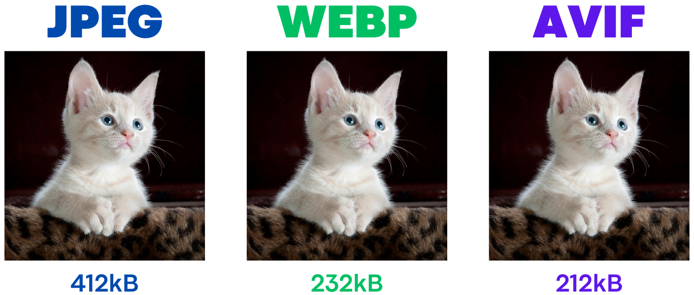
As a general rule, you should serve a lossy WebP or AVIF version of your LCP image (better yet, use these formats for all your images, but we're focusing on LCP here). With WebP support at around 95% and AVIF support at 92%, it still makes sense to serve older, fallback images as well. To do this, use 'progressive enhancement' where we serve these modern formats only to browsers that support them.
Decoding Speed vs. Compression Trade-off
While AVIF offers the best compression (smallest file size), its complex algorithms can require more CPU power to decode into a renderable image compared to WebP. This is a CPU-bound task that happens on the browser's Rasterizer threads and directly increases the Element Render Delay. A smaller AVIF might download faster, but its longer decode time could negate that benefit, especially on mobile devices. You can diagnose this in the Chrome DevTools Performance panel by looking for long-running "Decode Image" tasks associated with your LCP element. If you see this, it's a clear signal that decoding speed is your bottleneck, not just download time.
Expert Insight: The Case of JPEG-XL. A true expert guide must address JPEG XL. It is a technically remarkable format, especially for its ability to losslessly re-compress existing JPEGs (a huge win for legacy sites) and its support for progressive decoding, which AVIF lacks. However, its decisive drawback is the lack of broad browser support after being dropped by Chrome. This makes it not yet viable for general web use, but positions it as one to watch for the future.
Using the <picture> element: The <picture> element allows browsers to skip unsupported image formats,
selecting the first one they can handle. Here's how to do it:
<picture>
<source srcset="img.avif" type="image/avif">
<source srcset="img.webp" type="image/webp">
<img src="img.jpg" alt="Image" width="123" height="123">
</picture>
Combining Format Negotiation with Responsive Sizes
For maximum performance, you should combine format selection with responsive image sizes in a single <picture> element. This ensures every user gets the optimal format and the optimal size for their device. The browser evaluates <source> elements top to bottom and selects the first format it supports, then uses the srcset and sizes attributes to pick the right resolution.
<picture>
  <source
    type="image/avif"
    srcset="hero-400w.avif 400w, hero-800w.avif 800w, hero-1200w.avif 1200w"
    sizes="(max-width: 600px) 100vw, (max-width: 1200px) 800px, 1200px">
  <source
    type="image/webp"
    srcset="hero-400w.webp 400w, hero-800w.webp 800w, hero-1200w.webp 1200w"
    sizes="(max-width: 600px) 100vw, (max-width: 1200px) 800px, 1200px">
  <img
    src="hero-800w.jpg"
    srcset="hero-400w.jpg 400w, hero-800w.jpg 800w, hero-1200w.jpg 1200w"
    sizes="(max-width: 600px) 100vw, (max-width: 1200px) 800px, 1200px"
    alt="Descriptive alt text for hero image"
    width="1200" height="675"
    fetchpriority="high">
</picture>
This pattern gives the browser complete freedom to choose the best combination of format and resolution. A mobile user on a supported browser will get a small AVIF file, while an older desktop browser will fall back to a correctly sized JPEG.
Using content negotiation
Content negotiation lets your server serve different image formats based on browser support. Browsers announce supported formats via the Accept header. For instance, in Chrome, the Accept header for images looks like this:
Accept: image/avif,image/webp,image/apng,image/*,*/*;q=0.8
Then, on the server side, read the accept header and based on the header serve the 'best format'.
3. Use Responsive Images
When it comes to optimizing LCP images, size really does matter. One of the easiest wins is serving images with the smallest possible dimensions that still look good on your users' screens. Large images serve no function at all: they waste bandwidth and slow down load times, especially for users on slower connections or mobile devices.
To ensure you're not wasting pixels, follow these steps:
Responsive Images:
Use the srcset attribute to serve different image sizes based on the user's device. This way, smaller devices get smaller images, which helps speed up the LCP.
Why the sizes Attribute is Critical
Using srcset with w descriptors but omitting the sizes attribute is a common and costly error. Without the sizes attribute, the browser is forced to assume a default value of 100vw (100% of the viewport width). This means on a large desktop screen, the browser will download a massive image from your srcset list, even if the image is only displayed in a small 500px column. You've provided the right ingredients (srcset) but left out the recipe (sizes), leading to wasted bandwidth and a slower LCP. The sizes attribute provides the necessary layout context, telling the browser how wide the image will actually be at different viewport breakpoints, allowing it to make an intelligent download choice.
Understanding w vs. x Descriptors
The srcset attribute supports two types of descriptors. For responsive design where an image's size changes with the viewport, the w (width) descriptor is the superior and necessary choice. It is used with the sizes attribute to let the browser choose the best image based on its rendered size in the layout. The simpler x (device-pixel-ratio) descriptor only considers the screen's pixel density, ignoring how large the image actually is in the layout, making it suitable only for fixed-size images like icons.
<img
  src="img.jpg"
  srcset="img-400px.jpg 400w, img-800px.jpg 800w, img-1200px.jpg 1200w"
  sizes="(max-width: 600px) 400px, (max-width: 1200px) 800px, 1200px"
  alt="Image" width="123" height="123">
4. Scale Your Images to the Screen Size!
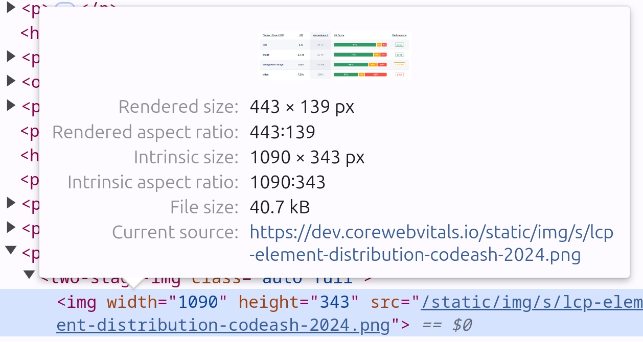
Avoid serving images that are larger than necessary. If the LCP element is only 600px wide in the viewport, make sure the image is no larger than that. Trust me, I see this happening every day! To check, just do this: inspect the image by right clicking the image and select 'inspect-element'. You will now see the dev-tools and the image HTML is highlighted with a blue background. You can now see the image rendered size (443 x 139px) is much smaller than the intrinsic image width (1090x343px). That is almost 3 times as large and resizing the image could have saved at least 50% of the file size.
5. Use Eager Loaded LCP Images
To get the best performance out of your LCP, you should eagerly load the visible LCP element (and lazy load images that aren't immediately visible). This is one of the most common mistakes in LCP optimization, and we cover it in detail in our article on fixing lazily loaded LCP images.
Eager Loading: The LCP element (usually above-the-fold content) should always be
loaded eagerly. This ensures it appears as quickly as possible, reducing the time it takes for your Largest
Contentful Paint to render. By default, images load eagerly unless specified otherwise, but double-check that
you haven't set loading="lazy" on the LCP image. Doing so can significantly delay the LCP and hurt your Core Web
Vitals score. It's important to understand that loading="eager" is the browser's default behavior,
so omitting the attribute entirely has the same effect. The critical action is to ensure
loading="lazy" is not present.
Geek alert: Lazy images are not enqueued by the preload scanner. The preload scanner is a super
fast secondary HTML scanner that enqueues important resources immediately. When the preload scanner is bypassed, the
browser will have to wait for the rendering engine to complete before it enqueues 'visible images'. For the browser
to evaluate native loading="lazy", it must first download and parse all render-blocking CSS to
construct the render tree. Only after the layout is calculated can the browser determine if the image is in the
viewport. This means your entire CSS becomes a blocking dependency for the LCP image download, which is a
performance disaster.
<img src="lcp-image.jpg" alt="Main image" width="800" height="400">
For images that appear below the fold (those not visible when the page first loads), lazy loading is the way to go. By delaying the loading of these images until the user scrolls near them, you free up bandwidth for more important content, like your LCP element. In this way lazy loading is a double-edged knife: if used correctly it will speed up your LCP content; if used incorrectly it will slow it down!
<img src="non-visible-image.jpg"
     alt="Secondary image"
     loading="lazy"
     width="800" height="400">
The balance? Eagerly load the critical content (like your LCP image) and lazy load less critical resources and below the fold images!
6. Preload the LCP Image
Preloading the LCP image tells the browser to fetch it immediately, before it naturally discovers it in the HTML. For a complete guide to preloading, see our dedicated article on preloading the LCP image.
Why Preload the LCP Image?
When the browser loads a page, it processes the HTML, stylesheets, and scripts in a certain order. Sometimes, the LCP image is referenced further down the chain, meaning the browser gets to it later than it should. Preloading the LCP image lets the browser know upfront that this image is critical and should be loaded immediately, reducing the delay in rendering your largest element.
How to Preload the LCP Image
By using the <link rel="preload"> tag, you can make sure the browser starts fetching the LCP image as early as
possible in the loading process.
<link rel="preload" href="lcp-image.jpg" as="image" type="image/jpeg">
This ensures that the LCP image is in the browser's queue from the start, avoiding the wait that often occurs if the image is buried in CSS or scripts.
Expert Insight: Responsive Preloads and fetchpriority
A simple preload is not enough for responsive images. To avoid performance-killing double downloads, you must use
the imagesrcset and imagesizes attributes on the preload link itself to mirror the
logic on your <img> tag. This is the expert-level implementation that separates top-performing sites from the
rest.
<!-- In the <head> -->
<link rel="preload" as="image"
      href="lcp-image-800w.jpg"
      imagesrcset="lcp-image-400w.jpg 400w, lcp-image-800w.jpg 800w"
      imagesizes="(max-width: 600px) 400px, 800px">

<!-- In the <body> -->
<img src="lcp-image-800w.jpg"
     srcset="lcp-image-400w.jpg 400w, lcp-image-800w.jpg 800w"
     sizes="(max-width: 600px) 400px, 800px"
     alt="..." width="800" height="450" fetchpriority="high">
Including fetchpriority="high" on the <img> tag provides a fallback, ensuring the image is
still prioritized if the preload is not supported. It's a belt-and-suspenders approach: the preload starts the download early, and fetchpriority makes sure it wins the bandwidth race.
Remember: Only preload the LCP image, as preloading too many resources can overwhelm the browser and hurt performance. Stick to what matters most for your Core Web Vitals.
7. Remove Fade-In Animations from the LCP Image
Fade-in animations can be visually appealing, but they're a hidden LCP bottleneck. If the LCP element (often an image) uses a fade-in effect, the browser won't count the LCP until the animation finishes. This delays the LCP timing and can significantly hurt your performance metrics.
Expert Insight: The Mechanism of Animation Delay
This problem isn't limited to just fade-ins. It applies to any animation that transitions an element from an
initially invisible or off-screen state, such as slide-ins (e.g., starting with
transform: translateX(-100%)) or zoom effects (e.g., starting with
transform: scale(0.5)). The LCP logic is designed to measure when the largest element is visually
stable and complete. An element that is still animating is not considered stable. This directly increases the
Element Render Delay sub-part of LCP, as the browser has already downloaded the image but is being
artificially held back from painting the final frame until the animation concludes.
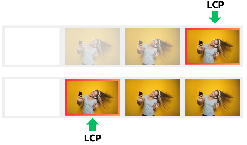
LCP Timing Happens After the Animation Ends: The browser considers the LCP complete only when the element is fully visible. If you have a fade-in animation, the timer keeps running until the image or content has completely faded in, which can easily add extra seconds to your LCP score.
Keep It Simple: To ensure the LCP element appears as quickly as possible, avoid using fade-in effects. Let the image load and display immediately, without any transition or animation.
Skip fade-ins on the LCP image. The visual effect is not worth the performance cost.
8. Self-Host the LCP Element
Self-host your LCP image. Relying on third-party servers introduces delays that are completely outside your control, which can hurt your LCP and overall page performance.
Think of it like this: Not self-hosting your LCP element is like constantly borrowing sugar from your neighbor. Every time, you have to walk over, wait at the door, and hope they are home. Relying on a third-party server for your LCP makes your website wait for that external resource, slowing down load times. Self-hosting is like keeping the sugar in your kitchen: fast, direct, and reliable.
Reduce External Dependencies: When your LCP element (like an image) is hosted on a third-party server, you're at the mercy of that server's speed, availability, and any additional round-trip times (RTT). Self-hosting eliminates this uncertainty, allowing you to serve the image directly from your own server, ensuring faster and more reliable delivery.
Expert Insight: The Modern CDN as a Single Origin
The core principle is to minimize new origin connections (DNS, TCP, TLS). The most advanced architecture achieves
this by using a modern CDN as a reverse proxy for the entire domain. From the browser's perspective, it only
ever connects to one origin (e.g., www.yourdomain.com), completely eliminating connection
penalties. The CDN then intelligently routes requests behind the scenes, fetching dynamic content from your
origin server and serving static assets like images from its edge cache. When this single connection is powered
by HTTP/3, you get the best of all worlds: a unified origin, reduced connection setup time, and mitigation
of head-of-line blocking.
Use Caching and Optimizations: By self-hosting, you can take full advantage of caching strategies and serve the image from the closest server to the user, especially if you're using a CDN. This reduces the time it takes to load the LCP element, resulting in faster rendering.
Control Over Image Optimization: Self-hosting gives you control over how the image is optimized, whether it's compression, resizing, or format selection, without relying on third-party handling. This way, you can ensure the image is perfectly tailored for fast loading.
9. Avoid Client-Side Rendering for the LCP Element
Client-side rendering (CSR) is one of the worst things you can do to your LCP. If your LCP element (usually a large image, text block, or video) is rendered on the client side via JavaScript, it often leads to slower LCP times as the browser has to wait for scripts to download, parse, and execute before displaying the critical content.
Delays in Rendering: With CSR, the LCP element is only displayed after the browser processes JavaScript, which can significantly delay its appearance. The longer this takes, the worse your LCP score becomes. Every extra second spent processing scripts translates into a longer wait for your users to see the most important content.
Expert Insight: Why CSR Hurts LCP
The primary performance penalty of CSR for LCP is that it hides the LCP image from the browser's high-speed preload scanner. This scanner's job is to find resources in the initial HTML and fetch them immediately. When an image is rendered with JavaScript, it's invisible to this scanner, creating a long and unnecessary discovery delay.
Switch to Server-Side Rendering (SSR) or Static Rendering: By rendering the LCP element server-side or as part of a static HTML response, you allow the browser to load and display it immediately, without waiting for JavaScript to kick in. This drastically improves LCP timing, as the browser can render the LCP element right away when it starts loading the HTML.
Minimize JavaScript on Critical Path: If you can't avoid some client-side scripts, make sure they don't block the LCP element from rendering. Defer or async non-critical scripts to prevent them from delaying the appearance of your LCP.
10. Reserve Space to Prevent Layout Shifts
Always include explicit width and height attributes on your <img> tags. This is a critical instruction to the browser, allowing it to calculate the image's aspect ratio and reserve the correct amount of space in the layout before the image has downloaded.
Expert Insight: Modern width and height Behavior
A common misconception is that these attributes make an image non-responsive. This is no longer true in modern browsers. The browser uses these HTML attributes to compute an aspect ratio and hold the space, but the image will still be perfectly responsive if its CSS is set to width: 100%; height: auto;. Providing these attributes is superior to using only the CSS aspect-ratio property, as the browser can reserve the space before any render-blocking CSS has been downloaded and parsed, giving it a critical head start.
Handling CSS Background Images
This principle also applies to elements that serve as containers for a CSS background-image. A common source of layout shift is a <div> that collapses to zero height initially and then pops into size when the background image is applied. To prevent this, use the CSS aspect-ratio property directly on the container element to reserve the necessary space from the start.
11. Audit for Main-Thread Blocking
Even if your LCP image is perfectly optimized and prioritized, its final rendering can be delayed if the browser's main thread is busy executing heavy JavaScript. Often, the source of this blocking is third-party scripts for analytics, ads, or customer support widgets. These scripts can monopolize the CPU, increasing the Element Render Delay. Use the Performance panel in Chrome DevTools to identify long-running tasks during the initial load, attribute them to their source, and defer or remove any that are not critical to the initial render. For more on this topic, see our guide on Element Render Delay.
Step-by-step guide: Diagnose LCP with the Chrome DevTools Performance panel shows how to record a throttled trace and spot these long tasks in the Main track.
Related LCP Optimization Guides
Image optimization is one piece of the puzzle. Each LCP phase has its own guide:
- Fix & Identify LCP Issues: The complete diagnostic methodology for finding and fixing LCP problems using field data and lab tools.
- Resource Load Delay: Ensure the browser discovers your LCP resource as early as possible with preload, fetchpriority, and optimal HTML structure.
- Resource Load Duration: Reduce download time through compression, CDN configuration, and network optimization.
- Element Render Delay: Clear the main thread so the browser can paint the LCP element immediately after download.
I write the code, not the report.
I join your team for 1 to 2 sprints. I set up the monitoring and make sure your team keeps the metrics green after I leave.
Get in touch
