Responsive Web Font Loading: A Device-Aware Strategy
A responsive font loading strategy for faster LCP and zero layout shifts

Responsive font display & responsive preloading strategy
As a Core Web Vitals specialist I see different creative solutions every day. Most do not make a lot of sense but every so often I come across a strategy that is so simple and so elegant that it does make sense for certain sites.
According to the 2025 Web Almanac, 88% of websites use web fonts, loading a median of 4 font files per page. Yet only 12% of sites preload fonts, and a mere 0.5% use font-display: optional. Most sites treat font loading as a one-size-fits-all problem. This article explains a smarter approach: loading fonts differently for desktop and mobile.
The strategy combines responsive preloading with font-display: optional on desktop (eliminating the Flash Of Unstyled Text) and font-display: swap on mobile (prioritizing fast text rendering over visual consistency).
Last reviewed by Arjen Karel on March 2026
Table of Contents!
- Responsive font display & responsive preloading strategy
- The problem with early font loading
- Understanding font-display: optional vs swap
- Responsive font strategy to the rescue!
- Implementation using <link rel="preload"> and media queries
- Reducing layout shifts on mobile with fallback font matching
- Benefits of this approach
- Real-world impact
- When to use this strategy (and when not to)
tip: this strategy works well for sites with a larger critical rendering path, meaning sites that load multiple fonts, stylesheets, and scripts before the LCP element. If your site loads a single lightweight font, the added complexity is not worth it.
The problem with early font loading
When optimizing the Core Web Vitals there is one simple rule that always applies:
"Everything that you do before the Largest Contentful Paint will slow down that Largest Contentful Paint".
This principle applies to web fonts as well. Prioritizing web font loading during page load can improve user experience, but if your site is struggling to meet Core Web Vitals thresholds, especially for specific device types, you may need to balance UX against improving LCP.
The 2025 Web Almanac Performance chapter shows that text is the LCP element on nearly 24% of mobile pages. When text is the LCP element, font loading strategy directly affects your LCP score. On the remaining 76% of pages where an image is the LCP element, fonts still compete for early network bandwidth and can push the image load back.
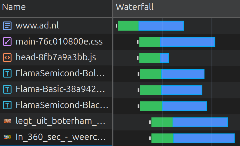
Let's consider the example below of a Dutch newspaper site. On a mobile device 3 fonts are enqueued before the LCP element. This makes the 3 fonts compete for early network resources and push back the image timing.
Understanding font-display: optional vs swap
Before diving into the responsive strategy, you need to understand the two font-display values it relies on. For a broader overview of font-display, see how to ensure text remains visible during webfont load.
font-display: swap shows the fallback font immediately and swaps in the custom font once it loads. This is great for LCP because text is visible from the start. The downside: when the custom font arrives and replaces the fallback, the different font metrics can cause a visible layout shift, hurting your CLS score. About 50% of sites use swap, making it by far the most popular value.
font-display: optional gives the browser roughly 100ms to load the font. If the font arrives in time (typically from cache or a fast preload), it is used. If not, the fallback font is used for the entire page load and no swap ever occurs. This means zero layout shifts, but the custom font may not show on first visit. Only 0.5% of sites use optional, despite it being the most CLS-safe option.
Since Chrome 83, combining font-display: optional with <link rel="preload"> blocks first paint for up to ~100ms (with a 1500ms absolute maximum), waiting for the font to arrive. If the font is preloaded, it almost always arrives within that window. The result: styled text on first paint, zero FOUT, zero layout shifts. This is why the desktop side of the responsive strategy works so well.
Responsive font strategy to the rescue!
In cases like this where there is much early network competition it makes sense to distinguish between device types. Typically faster desktop devices on wired (and faster network connections) can handle more early network resources all at once and it makes perfect sense to preload some critical font files.
Mobile devices on the other hand might be used on the commute to work under less than optimal network conditions. Mobile devices also often have slower CPUs and less available memory compared to desktops. These limitations mean that treating font loading differently based on device type can make sense.
- Desktop: Preloading fonts improves rendering performance on devices with better bandwidth and processing power. Use
font-display: optionalto eliminate font-swapping issues. Combined with a preload, Chrome will briefly block rendering (up to ~100ms) to wait for the font, giving you styled text on first paint with zero CLS. - Mobile: Do not preload the font because of network competition. Use
font-display: swapfor faster text rendering. This approach displays fallback fonts immediately while the custom font continues to load in the background, offering a better experience on less powerful devices.
Implementation using <link rel="preload"> and media queries
Instead of loading the font universally, you can use the media attribute in the HTML's <link> tag along with CSS to apply different font strategies based on device types.
Complete implementation
<head>
  <!-- viewport meta MUST come before media-conditional preloads -->
  <meta name="viewport" content="width=device-width, initial-scale=1">

  <!-- Preload font for desktop only -->
  <link rel="preload" href="/fonts/custom-font.woff2"
        as="font" type="font/woff2" crossorigin
        media="(min-width: 768px)">

  <style>
    /* Mobile: swap ensures fast text rendering */
    @font-face {
        font-family: 'CustomFont';
        src: url('/fonts/custom-font.woff2') format('woff2');
        font-display: swap;
    }

    /* Desktop: optional + preload = styled text on first paint */
    @media (min-width: 768px) {
        @font-face {
            font-family: 'CustomFont';
            src: url('/fonts/custom-font.woff2') format('woff2');
            font-display: optional;
        }
    }

    body {
        font-family: 'CustomFont', sans-serif;
    }
  </style>
</head>
A few important details about this implementation:
- Viewport meta tag ordering: The
<meta name="viewport">tag must appear before the preload link. The browser's preload scanner evaluates themediaattribute before parsing other meta tags. If the viewport is not set, the media query will be evaluated against the wrong dimensions on mobile devices. - Full @font-face declarations: Each
@font-faceblock must include bothfont-familyandsrc. Unlike regular CSS properties,@font-facedescriptors do not cascade. You cannot override justfont-displayin a second block without re-declaring the full font face. The browser will discard an incomplete@font-facerule. - The crossorigin attribute: Fonts preloaded without
crossoriginwill be fetched twice. Always include it on font preloads, even for same-origin fonts. - Matching breakpoints: The
mediaattribute on the preload (768px) must match the CSS media query (768px). If they do not match, you will preload on one breakpoint and apply the wrongfont-displayon another.
Reducing layout shifts on mobile with fallback font matching
The mobile strategy uses font-display: swap, which means there will be a brief Flash Of Unstyled Text when the custom font replaces the fallback. You can minimize this visual jump using CSS font metric overrides:
@font-face {
    font-family: 'CustomFont Fallback';
    src: local('Arial');
    ascent-override: 105%;
    descent-override: 25%;
    size-adjust: 97%;
}

body {
    font-family: 'CustomFont', 'CustomFont Fallback', sans-serif;
}
The ascent-override, descent-override, and size-adjust descriptors let you match the fallback font's dimensions to the custom font. When the swap happens, the text barely moves. These descriptors are supported in all modern browsers. Libraries like Capsize can calculate the right override values for your specific fonts automatically.
Benefits of this approach
- Desktop UX: Desktop renders with the web font on first paint, preventing both FOUT and FOIT. Zero layout shifts from font loading.
- Mobile performance:
font-display: swapensures users see text immediately, even if the custom font is not loaded yet. No preload means fonts do not compete with the LCP image for bandwidth. - Declarative simplicity: Pure HTML and CSS. No JavaScript, no font loading libraries, no framework dependencies. This also means it works with any resource prioritization strategy you already have in place.
Real-world impact
This strategy is based on a real world example that I came across auditing an e-commerce site. The site loaded 3 custom fonts: a heading font, a body font, and an icon font. On desktop, everything loaded fast enough that the fonts rarely caused issues. But on mobile over 4G, the three font preloads were competing with the hero image and pushing the LCP well above the 2.5 second threshold.
After implementing the responsive strategy (preloading only on desktop, removing font preloads on mobile):
- Desktop: Improved CLS and UX with styled fonts appearing on first paint. The preload +
font-display: optionalcombination eliminated all font-related layout shifts. - Mobile: Faster First Contentful Paint and Largest Contentful Paint because the fonts no longer competed for early bandwidth. The hero image loaded without contention.
Research from DebugBear confirms the impact: font preloading can improve LCP by roughly 30% (from 1.82s to 1.24s) when applied correctly. But when overused (one site had 38 preloaded fonts), preloading makes things worse. The responsive approach gives you the benefit of preloading on desktop without the cost on mobile.
Across sites monitored by CoreDash, roughly 82% of mobile page loads pass LCP when fonts are strategically preloaded, compared to 70% for pages that load all fonts the same way regardless of device type. On desktop, where the preload + optional combination works best, the gap is even wider.
When to use this strategy (and when not to)
Use this strategy when:
- Your site loads 2 or more custom font files
- Mobile and desktop have different Core Web Vitals performance profiles (common on sites where mobile struggles with LCP while desktop passes)
- Fonts are competing with other critical resources (hero images, critical CSS) on mobile
- You are self-hosting your fonts (this strategy works with any font hosting, but self-hosting gives you full control over the preload path)
Skip this strategy when:
- You only load one lightweight WOFF2 font (under 20 KB). The overhead of responsive loading is not worth it.
- Your site already passes all Core Web Vitals on both mobile and desktop. Do not add complexity to a problem you do not have.
- You rely on system fonts. If you are already using
font-family: system-ui, sans-serif, there is nothing to optimize.
After implementing this or any font loading strategy, monitor the impact with Real User Monitoring to confirm the change actually improved your field data. Lab tests can miss the variability in real network conditions that makes this strategy valuable in the first place.
Real time data. Not 28 day averages.
CoreDash segments every metric by route, device, browser, and connection type.
Explore CoreDash
