Optimize the Core Web Vitals for low end devices
Why fast sites on budget hardware require sharper trade-offs than most teams admit

Optimize the Core Web Vitals for low end devices
Core Web Vitals should be part of an objective benchmark for site quality. In practice, they are not! The metrics are tightly linked to the devices users bring to the table. If a business sells high-end products or services, its customers tend to own fast phones, desktops and reliable connections.
Contrast that with businesses targeting cost-conscious shoppers or emerging markets. Their audiences lean on aging phones, weak processors or poor network conditions.
The same website that breezes through a test on a flagship iPhone struggles to load acceptably on a mid-range Android or in countries with low bandwidth connectivity.
Last reviewed by Arjen Karel on March 2026
Table of Contents!
- Optimize the Core Web Vitals for low end devices
- The numbers tell the story
- Step 1: Generate a Client Capability Score
- Enable HTTP/3 with QUIC and 0-RTT
- Compress images more aggressively than your designer likes
- Strip CSS to what is strictly necessary
- Be blunt with scripts
- Use system fonts or at least avoid heavy custom fonts
- Monitor with real hardware, not just synthetic tests
The numbers tell the story
According to the 2025 Web Almanac, only 48% of mobile origins pass Core Web Vitals versus 56% on desktop. The sharpest gap is INP: 97% of desktop origins pass, but only 77% on mobile. That 20 percentage point gap is almost entirely caused by slower CPUs on Android devices.
The median mobile Total Blocking Time is 1,916 milliseconds. Desktop? 92 milliseconds. That is a 20:1 ratio. If your scripts run fine on your MacBook, they absolutely do not run fine on a budget phone.
According to Alex Russell's research, roughly 30% of devices in the wild are low-end (4 cores or less, 4GB RAM or less). These devices have single-core performance that is up to 9x slower than a current iPhone. In CoreDash Real User Monitoring data, we see that sites optimized for low-end devices pass CWV on 62% of mobile page loads, compared to just 41% for sites that only test on high-end hardware.
Step 1: Generate a Client Capability Score
To assess whether a visitor is using a high-end or low-end device, a Client Capability Score can be calculated directly in the browser. This score ranges from 0 (extremely constrained) to 100 (top-tier hardware). In practice, any device scoring below 40 should be classified as poor.
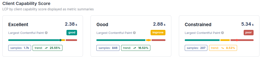
The function below computes the Client Capability Score using hardware and network indicators that correlate strongly with real-world RUM and Google's Core Web Vitals data. A higher score indicates that the device is more capable of delivering fast page performance with fewer resource constraints.
function getClientCapabilityScore() {
  const mem = navigator.deviceMemory || 4;
  let cpu = navigator.hardwareConcurrency || 4;
  cpu = Math.min(cpu, 8);

  let net = 4;
  if (navigator.connection) {
    const { effectiveType, rtt = 300 } = navigator.connection;
    const map = { 'slow-2g': 1, '2g': 2, '3g': 3, '4g': 4, '5g': 5 };
    net = map[effectiveType] || 4;
    if (rtt > 500) net = Math.max(net - 3, 1);
    else if (rtt > 300) net = Math.max(net - 2, 1);
    else if (rtt < 150) net = Math.min(net + 1, 5);
  }

  const score = mem + cpu * 0.5 + net * 2;
  return Math.min(100, Math.round(score * 5));
}

getClientCapabilityScore();
Core Web Vitals tip: These optimizations help everyone. But if someone is on a slow connection or using a device with limited memory, they matter a lot more. The downsides of skipping them show up faster.
Take image downloads. On a normal connection, they usually make up around 10% of the Largest Contentful Paint time. On a slow one, that can double without much effort. That is why we do not push image optimization to the top of the list for most users, but when dealing with low bandwidth or memory-constrained visitors, it quickly becomes a priority.
Enable HTTP/3 with QUIC and 0-RTT
Visitors far from your servers or stuck on slow networks face high round-trip times (RTT). HTTP/3, along with QUIC and 0-RTT, directly improves your initial connection speed. This is an important optimization for all visitors but especially critical for low bandwidth visitors. According to Cloudflare Radar, HTTP/3 now handles 21% of global web traffic. If you use Cloudflare, you can enable HTTP/3 in the Cloudflare dashboard.
- Faster connection setup: QUIC collapses the transport and encryption handshakes into one. 0-RTT goes further: repeat visitors send data immediately, bypassing handshakes altogether.
- Lower latency for returning users: 0-RTT lets clients resume sessions and send requests without pause. Hundreds of milliseconds saved, especially valuable for distant or mobile users.
- Resilient over long distances: HTTP/3 (over UDP) sidesteps TCP's head-of-line blocking. QUIC handles packet loss and unstable networks more gracefully. This makes a real difference for cross-continent or shaky mobile connections.
Compress images more aggressively than your designer likes
High-resolution images stall LCP, particularly on devices with limited GPU decompression power. The 2025 Web Almanac shows that the median mobile home page loads 911KB of images. That is 42% of the total page weight. On a budget device with a P75 downlink of 9 Mbps, those images compete directly with your critical resources.
Instead of giving in to aesthetics, aim for smaller, perceptually acceptable images. WebP and AVIF help, but lazy-loading and serving responsive sizes matter more.
A clean rule: for hero images on low-end devices, stay under 100KB. If the designer objects, they should test the same site on a 100€ Android phone before arguing further.
Strip CSS to what is strictly necessary
When it comes to styles there is only one rule: clean house. Remove unused selectors, reduce specificity, and collapse redundant rules.
Focus on predictable, consistent layouts with minimal overrides. Use a small set of utility classes rather than complex component-specific styles. That helps both the browser's CSSOM construction and developer maintainability.
For above-the-fold content, inline only what's absolutely necessary. Lazy-load the rest, but keep the split minimal and clear. You can use the Critical CSS Generator as a starting point, but define your critical CSS manually and surgically for the best result.
Be blunt with scripts
With a median mobile TBT of 1,916ms (up 58% year over year according to the 2025 Web Almanac), JavaScript is the single biggest problem on low-end devices. The P75 network speed for budget devices is about 9 Mbps down with 100ms RTT. Every kilobyte of JavaScript you ship gets parsed and executed on a CPU that is 9x slower than the phone you test on.
- No script should block rendering: Ensure all non-essential scripts are non-blocking. Use async or defer attributes on your <script> tags. If a script isn't essential for the initial page load or user interaction, it must not be synchronous. For a complete overview of deferral techniques, see 16 methods to defer JavaScript.
- Schedule non-critical scripts: Scripts that aren't required upfront should be scheduled. Use
requestIdleCallbackto fire scripts when the browser is idle. This allows you to offload heavy tasks without disrupting critical rendering paths. - Use the Client Capability Score to selectively load scripts: Use the score to decide what to load. On low-end devices, reduce the number of scripts and choose lighter alternatives. If the user has limited memory or an older CPU, don't waste resources loading heavy scripts. Prioritize performance over vanity features that might impress on high-end devices but frustrate on low-end ones.
Use system fonts or at least avoid heavy custom fonts
Loading custom fonts adds latency and janks layout. On devices with limited memory, they can also increase RAM pressure unnecessarily. According to the 2025 Web Almanac, 88% of sites load at least one web font, but only 12% preload them. The best option for performance, font-display: optional, is used by just 0.4% of sites.
System fonts render faster, respect user settings, and reduce layout shift. If branding mandates custom typography, subset aggressively and load fonts late. Consider self-hosting your fonts so you control the delivery.
Monitor with real hardware, not just synthetic tests
Synthetic testing tools (like Lighthouse, WebPageTest, etc.) simulate throttling but don't mimic all quirks of low-end hardware: thermals, throttling under real load, garbage collection pauses, and storage bottlenecks. Note that PageSpeed Insights changed its CPU throttling from 4x to 1.2x in December 2024, making lab scores even less representative of real budget device performance.
Buy a cheap Android phone and browse your site. If you can't stomach doing that regularly, use a RUM tool like CoreDash and segment data by device class. If your P75 LCP is fine on iPhone 15 but terrible on Xiaomi Redmi 9, it's time to be honest about whom you're optimizing for.
CoreDash has MCP built in.
Connect it to Claude or any AI agent. Ask it why your INP spiked last Tuesday.
See how it works
