Defer Offscreen Images on Mobile: Native Lazy Loading Guide
Native lazy loading, content-visibility, and why JavaScript image deferral is dead weight

Mobile Image Deferral: the standard
Mobile pages fight over limited connections and limited CPU. Every offscreen image you load upfront steals bandwidth from the images and scripts that actually matter for the initial paint.
Last reviewed by Arjen Karel on March 2026
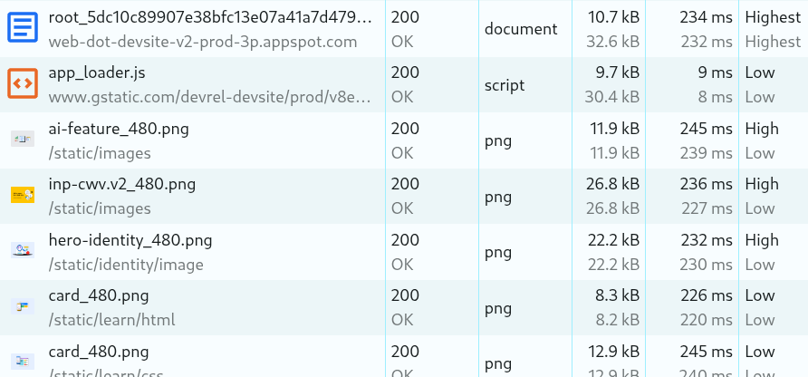
Table of Contents!
1. Defer offscreen images on mobile: native lazy loading
When a browser loads a page, it opens a limited number of parallel connections (depending on a lot of factors but 6 per domain is a common average). If these connections are used for downloading offscreen images (e.g., a footer logo or carousel slide), the download of critical resources (typically the LCP image, important scripts and fonts) will compete for slots and bandwidth. This is network contention, and it directly degrades your Core Web Vitals.
By deferring offscreen images using the native loading attribute, you prioritize what matters. The browser fetches only what is immediately visible, reserving bandwidth for the assets that impact Largest Contentful Paint (LCP) and First Contentful Paint (FCP). Native lazy loading offloads this prioritization to the browser's own mechanism, which is faster and removes the need for JavaScript lazy loading libraries.
Implementation
For all images below the initial viewport ("the fold") add the loading="lazy" attribute.
<!-- Standard Deferred Image -->
<img src="product-detail.jpg"
     loading="lazy"
     alt="Side view of the chassis"
     width="800"
     height="600"
     decoding="async">
The width and height attributes are essential. Without them, the browser cannot reserve space before the image loads, which causes layout shift (CLS). 62% of mobile pages still fail to set explicit dimensions on at least one image.
How lazy loading works on mobile: The Browser Heuristic
Native lazy loading is superior to JavaScript solutions because the browser adjusts the loading threshold (when an image is triggered for download) based on the Effective Connection Type (ECT).
- On 4G/WiFi: The Blink engine (Chrome/Edge) uses a conservative threshold of about 1,250px. It assumes low latency and fetches the image only when the user scrolls relatively close.
- On 3G/Slow-2G: The threshold expands to about 2,500px. The browser starts the request much earlier to compensate for high round-trip times, so the image is ready before the user scrolls it into view.
According to the 2025 Web Almanac, the median mobile page loads 15 images totaling 911 KB. Only about 26% of those images use loading="lazy". The rest load eagerly, competing for the same limited connections. On a typical 4G mobile connection, that means the LCP image is stuck waiting behind a dozen images the user will not see for several seconds.
Critical Exception: The LCP Candidate
A common performance regression: applying loading="lazy" to the Largest Contentful Paint element (typically the hero image). This delays the fetch until layout is complete.
Google's research shows that lazy-loading the LCP image adds 624ms to the median LCP. That is not a theoretical risk. 17% of mobile pages still make this mistake according to the 2025 Web Almanac. If Lighthouse flags this, see how to fix the lazy-loaded LCP warning.
The LCP image must be eager-loaded and prioritized:
<!-- Hero Image: Eager and Prioritized -->
<img src="hero.jpg"
     alt="Summer Collection"
     width="1200"
     height="800"
     loading="eager"
     fetchpriority="high">
Do not combine loading="lazy" with fetchpriority="high". They contradict each other: lazy tells the browser to wait, high tells it to hurry. The browser ignores the priority hint when lazy is set. For more on how browsers prioritize resources, see the resource prioritization guide.
2. Mobile complexities: Viewport and Touch
Mobile viewports are not static. The visible area changes as the user scrolls, rotates the device, or triggers the URL bar to retract. This is where native lazy loading has a real advantage over JavaScript solutions.
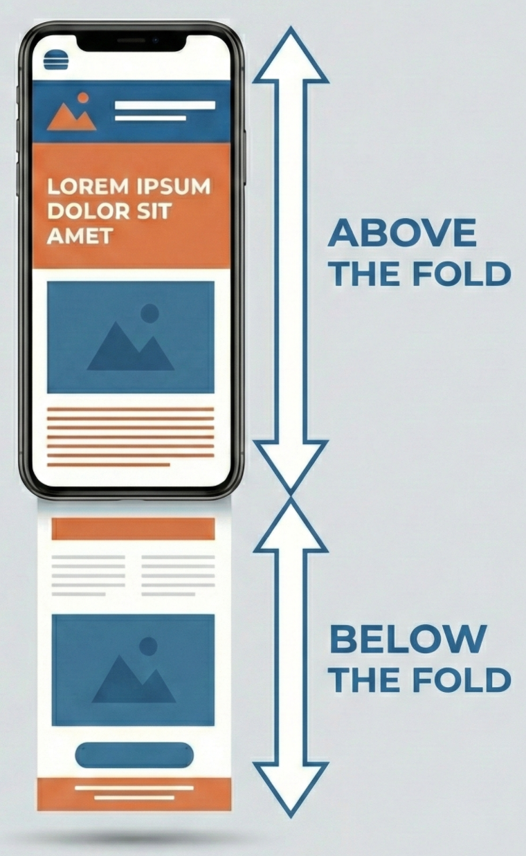
- The Viewport: The visible rectangular area of the browser window. On mobile, this is dynamic; it changes dimensions based on device orientation (portrait vs. landscape) and the state of the browser chrome (URL bars retracting).
- The Fold: The exact bottom edge of the viewport. It is the threshold that separates visible content from off-screen content.
- Above the Fold: Any content visible immediately upon page load without scrolling. Images here are critical and should never be lazy-loaded.
- Below the Fold: Any content located vertically past the fold. This content is non-critical and should be deferred until the user scrolls near it.
The Dynamic Viewport
On mobile browsers, the viewport height (vh) is fluid. As the user initiates a touch scroll, the URL bar and navigation controls often retract, changing the visible area size.
JavaScript lazy loading libraries typically calculate viewport height (window.innerHeight) once at page load. When mobile browsers dynamically resize the visible area by hiding the URL bar during a scroll, JavaScript methods continue to use the old, smaller height value. Images stay unloaded even when they enter the expanded viewport, causing blank placeholders for visitors.
The browser's internal layout engine tracks the visual viewport automatically, so native lazy loading triggers fire regardless of viewport size changes. This is one reason to prefer native lazy loading over any JavaScript alternative.
3. Mobile Image Decoding and CPU Throttling
Mobile devices have limited CPU and image decoding on mobile can be relatively slow and expensive. Converting a JPEG into a bitmap requires many CPU cycles. On a mobile processor, decoding a sequence of larger images can block the main thread for 50ms to 100ms each, causing input latency.
The Fix: content-visibility
The CSS property content-visibility: auto acts as lazy rendering. It instructs the browser to bypass the layout and painting phases for off-screen elements entirely. The element exists in the DOM, but it does not exist in the Render Tree until it approaches the viewport.
Because this optimization works by skipping the rendering of an element's subtree, you cannot apply it directly to an <img> tag (which has no subtree). Apply content-visibility to the product container or image card that hosts the images and its content:
@media (max-width: 768px) {
    .image-card, .product-card {
        /* Skip rendering of the container and its children */
        content-visibility: auto;

        /* Essential: Prevents container from collapsing to 0px height */
        contain-intrinsic-size: auto 300px;
    }
}
This ensures that even if an image is downloaded, the browser does not pay the layout/paint cost until the user actually scrolls to it.
content-visibility reached Baseline status in September 2024 when Safari 18 shipped support. It now works in 93% of browsers globally. Google's benchmarks show a 7x rendering performance boost on initial load for pages with many off-screen sections.
If you want to verify the rendering improvement on real devices, Real User Monitoring will show you the actual INP and LCP impact across your mobile traffic. Across sites monitored by CoreDash, pages using content-visibility: auto on product grids show roughly 15% better INP on mobile compared to pages without it.
4. Legacy Methodologies: Why to avoid them
Before loading="lazy" had browser support, JavaScript was the only option. With native lazy loading at 95% global support, these JavaScript methods are technical debt. Remove them.
The Scroll Handler Era (2010 to 2016)
Early implementations attached event listeners to the scroll event.
// Obsolete: do not use
window.addEventListener('scroll', () => {
    images.forEach(img => {
        if (img.getBoundingClientRect().top < window.innerHeight) {
            img.src = img.dataset.src;
        }
    });
});
Main Thread Blocking: The scroll event fires dozens of times per second. Executing logic and calculating layout (getBoundingClientRect) during active scrolling causes frame drops (jank).
Layout Thrashing: Querying geometric properties forces the browser to synchronously recalculate layout, a computationally expensive operation on mobile CPUs.
The IntersectionObserver Era (2016 to 2019)
The IntersectionObserver API improved performance by asynchronously observing changes in element visibility.
// Legacy: prefer native loading="lazy" where possible
const observer = new IntersectionObserver((entries) => {
    entries.forEach(entry => {
        if (entry.isIntersecting) {
            const img = entry.target;
            img.src = img.dataset.src;
            observer.unobserve(img);
        }
    });
});
Script Dependency: It requires JavaScript execution. If the main thread is busy hydrating a framework (React/Vue), the images remain unloaded even if they are in the viewport.
Lack of Network Awareness: Unlike native loading, IntersectionObserver uses fixed margins (e.g., rootMargin: '200px'). It does not automatically expand its buffer on slow networks, leading to blank flashes for users on poor connections.
For a complete overview of image optimization techniques beyond lazy loading, or to learn about deferring CSS background images (which loading="lazy" does not cover), see those dedicated guides.
Find out what is actually slow.
I map your critical rendering path using real field data. You get a prioritized fix list, not a Lighthouse report.
Get the audit
