Fix 'Defer Offscreen Images': Lazy Loading Guide for Core Web Vitals
Defer offscreen images and improve the Core Web Vitals

'Defer offscreen images' in short
While loading any page with offscreen images, a browser will often need to download more images than strictly necessary. This causes a delay in page rendering.
Fix this by adding loading="lazy" to all below-the-fold images. Native lazy loading is supported by all major browsers with 95% global coverage.
Last reviewed by Arjen Karel on February 2026

What is 'defer offscreen images'?
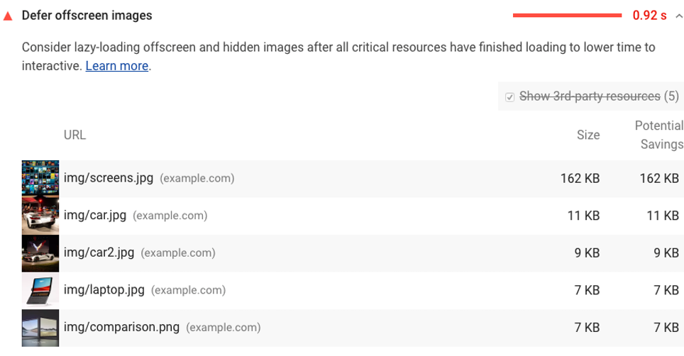
The defer offscreen images warning was a Lighthouse audit that flagged pages with images that could be lazy loaded. Lighthouse flagged images that met all of these criteria:
- The image ends below 3 times the viewport height.
When an image is not lazy loaded and ends below 3 times the height of the visible part of the page, and starts below the visible part of the page. - The image is larger than 0.02 MB or takes more than 50ms to load.
Images that are either small or inlined are ignored. Lazy loading scripts often use small placeholder images that fall below this threshold. - The image has no loading attribute defined.
Lighthouse ignores images that have either theloading="lazy"orloading="eager"attribute.
This audit was removed in Lighthouse 13
As of Lighthouse 13 (October 2025), this audit has been removed entirely. The Chrome team determined that modern browsers already deprioritize offscreen images, so the audit generated more noise than useful feedback.
But here is the thing: the optimization itself still matters. Lazy loading offscreen images reduces bandwidth, frees up network connections for critical resources, and improves your Largest Contentful Paint (LCP). The fact that Lighthouse no longer flags it means you need to check for it yourself. Use Real User Monitoring or manually audit your pages for images that load without loading="lazy".
A quick reminder: what is lazy loading?
Lazy loading means that images not in the visible part of the page are loaded at a later time, usually just before they scroll into view. The browser only fetches the image when the user gets close to it. This saves bandwidth and lets the browser focus on the resources that actually matter for the initial render.
What causes eager loaded offscreen images?
Images are not deferred by default. Offscreen images that are not deferred end up on the page because the loading attribute is missing or the image is not handled by a lazy loading library. Common causes:
- Badly coded plugins in your CMS.
- Plugins that disable native lazy loading.
- Background images (these need a different approach than
loading="lazy"). - Page builders that generate bad HTML (for example: Elementor or WP Bakery).
- Text that is copied and pasted into a WYSIWYG editor (like TinyMCE).
- Bad template coding.
How do offscreen images affect your Core Web Vitals?
Offscreen images do not directly impact Lighthouse metrics. But they make rendering a webpage unnecessarily complicated. Your browser will need to download more resources before the page can be displayed on screen. There are 3 problems with eager loaded offscreen images:
- More downloads before rendering. Your browser will need to download images that the user cannot even see yet.
- Critical resources get deprioritized. The images compete for bandwidth with resources that are actually needed for rendering, like your CSS and your LCP image.
- Higher memory usage. Decoding images the user has not scrolled to yet wastes memory, especially on low-end mobile devices.
According to the 2025 Web Almanac's Page Weight chapter, the median mobile page loads 15 images. At the 90th percentile, that number jumps to 52. On image-heavy pages, lazy loading the offscreen ones can make a real difference. Across sites monitored by CoreDash, 76% of pages that properly lazy load offscreen images pass LCP, compared to 59% of pages that do not.
How to fix 'defer offscreen images'
To fix eager loaded offscreen images, add loading="lazy" to every image that is below the fold. Native lazy loading is now supported by 95% of browsers globally, including Chrome, Firefox, Safari, and Edge. You do not need a library for this.
<img loading="lazy"
     src="image.webp"
     alt="a native lazy loaded image"
     width="300" height="300">
Trace the origins of your eager loaded images. Check which images load without a loading attribute and figure out what is placing them on the page. There are 5 usual suspects:
-
Badly coded plugins in your CMS.
Some plugins add HTML directly to the page and do not use the correct hooks that enable lazy loading. -
Plugins that disable native lazy loading.
Some plugins disable native lazy loading by default. Check your plugin settings. -
Page builders that generate bad HTML.
Page builders like Elementor or WP Bakery often create bloated code that is far from perfect. There is no easy fix for this. The solution includes cleaning up your code and changing your workflow. -
Text copied and pasted into a WYSIWYG editor.
Most WYSIWYG editors like TinyMCE do a bad job at cleaning up pasted code, especially when pasted from another rich text source like Microsoft Word. These editors might not add lazy loading to your images. - Bad template coding.
Even when lazy loading is enabled, hardcoded images in your templates might still not be lazy loaded. Check your templates for offscreen images and lazy load them.
Do not lazy load your LCP image
This is the most important rule of lazy loading: never apply loading="lazy" to your Largest Contentful Paint image. The LCP image is almost always the hero image or the largest visible element in the viewport. According to the 2025 Web Almanac, 16% of mobile pages still lazy load their LCP image. That single attribute can add 200 to 500 milliseconds to your LCP.
Instead, do the opposite for your LCP image. Make sure it loads as fast as possible with fetchpriority="high":
<img fetchpriority="high"
     loading="eager"
     src="hero.webp"
     alt="Hero image"
     width="1200" height="600">
If you accidentally lazy loaded your LCP image, read how to fix a lazily loaded LCP image. For a complete guide on optimizing images, see optimize images for Core Web Vitals.
Image loading cheatsheet
Not every image should be treated the same way. Here is how to handle the 4 most common scenarios:
| Image type | loading | fetchpriority | Why |
|---|---|---|---|
| LCP / hero image | eager |
high |
This is the most important image. Load it first. |
| Above the fold (not LCP) | eager |
(default) | Visible on load, but not the LCP element. |
| Below the fold | lazy |
(default) | Not visible yet. Defer until the user scrolls. |
| CSS background image | IntersectionObserver | loading="lazy" does not work on background images. Use a different approach. |
|
Native lazy loading vs lazy loading scripts
Use native loading="lazy". In 2026, there is no reason to add a JavaScript lazy loading library for standard <img> elements. Native lazy loading is supported by all major browsers including Safari (since version 15.4), covering 95% of users globally. It requires zero JavaScript, adds zero overhead, and works out of the box.
Libraries like lazysizes were essential before browsers supported native lazy loading. They are no longer maintained and no longer necessary for most sites. The only scenarios where you might still need a JavaScript solution:
- CSS background images. Native lazy loading only works on
<img>and<iframe>elements. For background images you need IntersectionObserver orcontent-visibility: auto. - Custom loading thresholds. Chrome starts loading "lazy" images roughly 1250px below the viewport on fast connections and 2500px on slow connections. You cannot customize this distance. If you need tighter control, an IntersectionObserver with a custom
rootMargingives you that.
If you do need a library, use vanilla-lazyload instead of lazysizes. It is actively maintained, uses IntersectionObserver, and supports background images.
Prevent layout shift on lazy loaded images
Always include width and height attributes on lazy loaded images. Without explicit dimensions, the browser does not know how much space to reserve. When the image finally loads, it pushes surrounding content down, causing Cumulative Layout Shift (CLS). According to the 2025 Web Almanac, 62% of mobile pages still have at least one image without dimensions.
<!-- Bad: causes layout shift -->
<img loading="lazy" src="photo.webp" alt="Photo">

<!-- Good: dimensions reserve space -->
<img loading="lazy" src="photo.webp" alt="Photo" width="800" height="600">
Workarounds when you cannot lazy load
Sometimes it is not possible to defer offscreen images. You might not have access to the template or your CMS might not support lazy loading. There are a few workarounds to lessen the impact. These are far from perfect and might introduce new challenges.
- Compress your images. Smaller images have less of an impact on loading performance than large images. Use modern compression techniques to reduce file size.
- Use faster image formats. Switch from PNG and JPEG to WebP or AVIF. WebP compresses to roughly 1.3 bits per pixel compared to 2.0 for JPEG according to the 2024 Web Almanac's Media chapter.
- Split large pages into multiple pages. Splitting large pages reduces the number of images that need to load at once.
- Implement infinite scroll. Infinite scroll is basically lazy loading, just not for images but for entire parts of the webpage. For pages with many repeated elements (think Pinterest), infinite scroll can speed up the initial load considerably.
For mobile-specific considerations, offscreen images are an even bigger problem because mobile connections are slower and mobile viewports are smaller, meaning more images end up offscreen.
Whatever approach you take, verify it works with real users. Set up Real User Monitoring to track whether your changes actually improve LCP and overall Core Web Vitals in the field.
I make sites pass Core Web Vitals.
500K+ pages for major European publishers and e-commerce platforms. I write the fixes and verify them with field data.
How I work
