Fix Layout Shift veroorzaakt door auto-sizing afbeeldingen
Afbeeldingen met auto width en auto height veroorzaken een layout shift. Leer hoe je dit kunt oplossen

Fix Layout Shift veroorzaakt door auto-sizing afbeeldingen
Er is een veelvoorkomend CSS patroon dat je Cumulative Layout Shift score met één enkele regel code zal verwoesten. Ik heb het op tientallen sites gezien, en het veroorzaakt een layout shift zelfs wanneer je expliciet de width en height op je afbeeldingen hebt ingesteld. Zelfs het instellen van de aspect-ratio CSS eigenschap zal dit niet oplossen.
Dit artikel focust op het width: auto CSS probleem. Voor de complete gids over alle oorzaken van image en media layout shifts (video's, iframes, art direction, responsive images, lazy loading, placeholders), zie Hoe Afbeeldingen en Media Layout Shift Veroorzaken.
Laatst beoordeeld door Arjen Karel in maart 2026
Het probleem
Hier is de CSS die het probleem veroorzaakt. Het wordt vaak gebruikt voor responsive images:
<style>
img {
    width: auto;
    height: auto;
    max-width: 100%;
}
</style>
De width: auto declaratie is het probleem. Het overschrijft de width die de browser berekent aan de hand van je HTML width en height attributen, wat betekent dat de browser niet langer ruimte kan reserveren voor de afbeelding voordat deze laadt. De afbeelding rendert op 0x0 pixels totdat het bestand is gedownload en gedecodeerd, en springt dan naar zijn volledige grootte. Dat is je layout shift.
Waarom dit gebeurt
Sinds 2019 mappen moderne browsers HTML width en height attributen naar een interne aspect-ratio presentational hint. Deze hint heeft nul CSS specificiteit. Elke auteur CSS regel overtreft dit, zelfs een simpele img { width: auto; }. Wanneer CSS width: auto instelt, verliest de browser de informatie die het nodig heeft om de gereserveerde height te berekenen op basis van de aspect ratio. Beide dimensies worden onbekend totdat de afbeelding laadt.
Dit is waarom het instellen van aspect-ratio in CSS het probleem ook niet oplost. Met width: auto herleidt de browser de width naar 0 voor een niet-geladen afbeelding. Een aspect ratio berekend vanaf een width van 0 resulteert nog steeds in een height van 0. De ruimtereservering werkt alleen wanneer de browser minstens één bekende dimensie heeft om mee te werken.
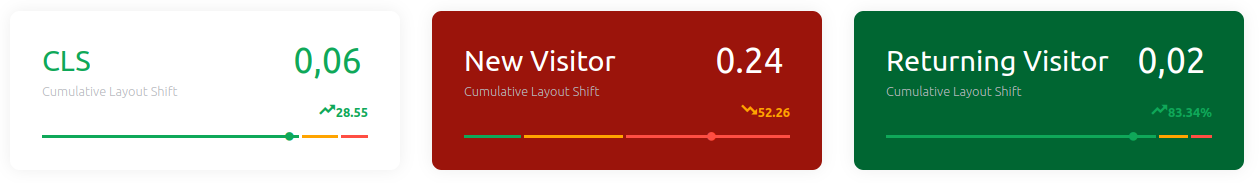
Het is ook verraderlijk omdat het alleen een layout shift veroorzaakt voor nieuwe bezoekers. Als je de afbeelding al in je browser cache hebt, zijn de intrinsieke dimensies direct beschikbaar en treedt er geen shift op. Jij, als developer, zult het waarschijnlijk nooit zien.
Hoe we dit hebben gevonden
Deze problemen zijn bijna onmogelijk te vangen in lab tests omdat Lighthouse draait op een snelle machine met een warme cache. De manier om ze te detecteren is met Real User Monitoring. RUM volgt de Core Web Vitals voor echte bezoekers op echte apparaten en rapporteert de daadwerkelijke CLS scores terug aan je, inclusief shifts die alleen gebeuren bij eerste bezoeken over trage verbindingen.
De 2025 Web Almanac rapporteert dat 62% van de mobiele pagina's nog steeds minstens één niet-gedimensioneerde afbeelding heeft. Veel daarvan worden veroorzaakt door exact dit CSS patroon: de developer stelt width en height in HTML in, maar een globale CSS regel overschrijft ze met auto.
De oplossing
Verwijder width: auto. Behoud height: auto en max-width: 100%. Dit is het patroon aanbevolen door web.dev voor responsive images die geen layout shifts veroorzaken:
<style>
img {
    height: auto;
    max-width: 100%;
}
</style>
Met deze CSS gebruikt de browser het HTML width attribuut om de breedte van de afbeelding te bepalen (gelimiteerd op 100% van de container door max-width), en height: auto berekent de juiste hoogte vanuit de aspect ratio. De ruimte wordt gereserveerd voordat de afbeelding laadt. Geen layout shift.
Zorg ervoor dat je <img> tags zowel width als height attributen bevatten:
<img src="hero.jpg" width="800" height="450" alt="Description">
Doe jezelf een plezier: klik met de rechtermuisknop op een afbeelding op je site, kies "Inspect Element", en controleer de berekende stijlen voor width: auto. Als je het ziet, weet je nu wat je moet doen.
Tip: Voor meer image optimization technieken, zie hoe je afbeeldingen optimaliseert voor Core Web Vitals en hoe je trage hero images fixt.
Live data. Geen 28-daags gemiddelde.
CoreDash splitst elke metric uit per route, toestel, browser en verbinding.
Bekijk CoreDash
