Metric Breakdown Dashboard
Understand how Core/Dash can help improve the Core Web Vitals and stay fast without regression
Trusted by market leaders
Using Data Tables for Granular Analysis
Let's be clear: charts and graphs are for spotting trends. They tell you a story from 30,000 feet. But real optimization, the work that has a tangible impact, happens on the ground. It happens when you move from the big picture to the specific, granular details. This is the domain of the data table.
While charts provide a high-level view, professionals use data tables to find the specific details needed for optimization. This is where you find the URLs, user segments, and elements responsible for performance problems and build a prioritized action plan.
The Anatomy of the Data Table
A data table is not just a list of numbers; it's a multi-dimensional tool for analysis. To use it effectively, you must understand what each column is telling you.
- Dimension Column (e.g., URL): This is the specific item being measured. It could be a page, a country, or a device type. It's the "what" or "who" of your analysis.
- Metric Column (e.g., LCP): This is the raw performance score for that specific item. It tells you how slow or fast it is, in absolute terms.
- Impressions: This is your traffic data. It answers the question: "How many users are affected?" A slow page with 10 impressions is an annoyance; a slow page with 100,000 impressions is a business crisis.
- Impact: This is arguably the most important column. It's a calculated metric that weighs the performance score by the number of impressions. A high impact score points to a problem that is both severe and affects a large number of users. It is a direct indicator of business priority.
- Distribution: This is a micro-chart that visualizes the breakdown of the metric for that specific row. It's a powerful "scent-trail" that allows you to spot patterns and diagnose the *why* without ever leaving the table.
Diagnostic Workflow
A common misstep is to simply sort the table by the performance metric, which can hide the true business impact. A more effective approach is required to focus your efforts for maximum return on investment.
- Sort by Impact, Not Speed: Your first action should always be to sort the table by the **Impact** column in descending order. This immediately brings the most critical business problems to the top. Your goal is to fix what matters most, not what is technically slowest.
- Identify High-Traffic Bottlenecks: Look at the top rows. These are the pages or segments where poor performance is affecting the largest number of users. These are your primary targets for optimization.
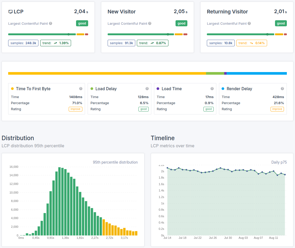
- Analyze the Distribution: Scan the **Distribution** column for these high-impact rows. Do you see a pattern? Is the `TTFB` portion of the bar consistently large for your slowest pages? This visual cue is your guide for the next level of investigation on the Metric Breakdown dashboard.
- Filter, Don't Hunt: Use the filtering options to narrow your focus. For example, filter the table to show only `mobile` traffic for pages that have a "needs improvement" status. This removes the noise and allows you to concentrate on a specific problem set.
Following this workflow transforms the data table from a passive list into an active, prioritized roadmap for improvement.
The Bottom Line
The data table is where strategy is executed. It provides the granular context that charts cannot, allowing you to focus your limited resources on the issues that have the largest negative impact on your users and your business. This is how you build a surgical, data-driven action plan.

