CSS transition으로 인해 발생하는 Layout Shift
layout shift를 유발하는 CSS transition을 찾고 제거하는 방법을 알아보세요

CSS transition이 layout shift를 유발하는 이유
CSS transition으로 인해 발생하는 Cumulative Layout Shift는 종종 페이지의 로딩 단계 초기에 발생합니다. 이러한 layout shift는 일관되게 발생하지 않기 때문에 디버깅하기 어렵습니다.
마지막 검토: Arjen Karel (2026년 3월)
Table of Contents!
transition: all의 문제점
transition과 관련된 layout shift의 가장 일반적인 원인은 transition: all입니다. 2022 Web Almanac의 CSS 장에 따르면, 페이지의 53%가 transition: all을 사용합니다. 즉, width, height, margin, padding과 같이 레이아웃에 영향을 미치는 속성을 포함하여 모든 속성 변경이 애니메이션 처리됨을 의미합니다.
CSS transition에는 property, duration, timing-function 및 delay가 있습니다. 단축형(shorthand)은 다음과 같습니다:
/* property | duration | timing-function | delay */
transition: margin-right 4s ease-in-out 1s;
개발자가 애니메이션을 적용할 정확한 속성을 지정하는 대신 transition: all .3s ease를 작성할 때 문제가 시작됩니다. 페이지 로드 중에 내비게이션 메뉴와 같은 스크롤 없이 볼 수 있는(above-the-fold) 요소는 초기(스타일이 지정되지 않은) 상태에서 최종(스타일이 지정되거나 숨겨진) 상태로 transition됩니다. transition 속성이 all인 경우 width, height 및 가시성(visibility)까지 포함됩니다. 결과적으로 로딩 중에만 발생하고 일관되게 재현하는 것이 거의 불가능한 layout shift가 발생합니다.
어떤 CSS 속성이 layout shift를 유발하나요?
모든 CSS transition이 layout shift를 유발하는 것은 아닙니다. 요소의 기하학적 구조나 위치를 변경하는 속성만이 브라우저의 레이아웃 단계를 트리거합니다. Google의 연구에 따르면 레이아웃을 유발하는 CSS 속성에 애니메이션을 적용하는 페이지는 CLS를 통과할 확률이 15% 낮습니다. margin 또는 border-width에 애니메이션을 적용하는 페이지는 CLS 불량률이 일반적인 비율의 거의 두 배에 달합니다.
layout shift를 유발하는 속성: width, height, margin, padding, top, left, right, bottom, border-width, font-size, display
안전한 속성 (합성 전용, layout shift 없음): transform, opacity, filter, clip-path
안전한 속성 (페인트 전용, layout shift 없음): background-color, color, box-shadow, outline
핵심 인사이트: transform 및 opacity는 전적으로 브라우저의 컴포지터(compositor) 스레드에서 처리됩니다. 이들은 레이아웃 재계산을 트리거하지 않으므로 CLS에 반영되지 않습니다. 요소를 이동해야 하는 경우 top/left 대신 transform: translate()를 사용하세요. 시각적으로 크기를 조정해야 하는 경우 width/height 대신 transform: scale()을 사용하세요.
아래 예시를 살펴보세요. 이는 페이지의 로딩 단계에서 발생하는 CSS transition으로 인한 layout shift를 보여줍니다. 이러한 패턴은 매우 자주 발생하며, 이러한 종류의 문제를 찾고 수정하는 것은 어려울 수 있습니다.
CSS transition 찾기 및 수정
CSS transition으로 인한 모든 layout shift를 찾고 수정하려면 간단한 테스트를 실행해야 합니다. 먼저 페이지의 모든 CSS transition을 찾습니다. 그런 다음 레이아웃에 영향을 미치는 속성을 변경하는지 확인합니다. 마지막으로 이러한 transition을 비활성화하거나 수정했을 때의 영향을 측정하여 CLS를 유발했는지 확인합니다.
Core Web Vitals 팁: CSS transition으로 인해 발생하는 Cumulative Layout Shift는 종종 페이지의 로딩 단계 초기에 발생합니다. 이러한 layout shift는 일관되게 발생하지 않기 때문에 디버깅하기 어렵습니다. 모바일 디바이스를 에뮬레이트하여 네트워크 속도를 늦추고 캐시를 비활성화하면 더 쉽게 찾을 수 있습니다!
1단계: CSS transition 찾기
CSS transition은 수동으로 찾을 수 있습니다. 모든 스타일시트를 검사하고 'transition'이라는 단어를 검색하세요. 10분도 채 걸리지 않는 작업이지만, 더 나은 방법이 있습니다! 이 스니펫을 콘솔에 붙여넣고 Enter 키를 누르기만 하면 됩니다.
(() => {

  let nodeTable = [];
  let nodeArray = [];

  // Get the name of the node
  function getName(node) {
    const name = node.nodeName;
    return node.nodeType === 1
      ? name.toLowerCase()
      : name.toUpperCase().replace(/^#/, '');
  }

  // Get the selector
  const getSelector = (node) => {
    let sel = '';

    try {
      while (node && node.nodeType !== 9) {
        const el = node;
        const part = el.id
          ? '#' + el.id
          : getName(el) +
          (el.classList &&
            el.classList.value &&
            el.classList.value.trim() &&
            el.classList.value.trim().length
            ? '.' + el.classList.value.trim().replace(/\s+/g, '.')
            : '');
        if (sel.length + part.length > (100) - 1) return sel || part;
        sel = sel ? part + '>' + sel : part;
        if (el.id) break;
        node = el.parentNode;
      }
    } catch (err) {
      // Do nothing...
    }
    return sel;
  };

  const getNodesWithTransition = (node) => {

    // Get the computed style
    let cs = window.getComputedStyle(node);
    let tp = cs['transition-property'];
    let td = cs['transition-duration'];

    // If there is a transition, add it to the table
    if (tp !== '' && tp !== 'none' && td != '0s') {
      nodeTable.push({ selector: getSelector(node), transition: cs['transition'] });
      nodeArray.push(node);
    }

    // Recursively call this function for each child node
    for (let i = 0; i < node.children.length; i++) {
      getNodesWithTransition(node.children[i]);
    }
  }

  // find all transitions
  getNodesWithTransition(document.body);

  // Display the results in the console
  console.log('%cReadable table of selectors and their transitions', 'color: red; font-weight: bold;');
  console.table(nodeTable);

  console.log('%cNodeList for you to inspect (harder to read but more info)', 'color: red; font-weight: bold;');
  console.log(nodeArray);


  // styles to temporarity override the transitions
  let selectors = nodeTable.map((item) => item.selector).join(', ');

  console.log('%cSpecific CSS to disable all transitions on this page', 'color: red; font-weight: bold;');
  console.log(`<style>${selectors}{transition-property: none !important;}</style>`);

  console.log('%cGlobal CSS to disable all transitions on this page (not suggested on production)', 'color: red; font-weight: bold;');
  console.log(`<style>*{transition-property: none !important;}</style>`);

})()
모든 transition, 해당 transition이 작동하는 요소, 그리고 transition에 대한 더 자세한 정보를 표 형태로 보여줍니다.
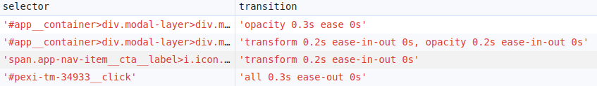
layout shift를 찾으려면 width, height, margin, padding, top, left, display와 같은 transition 속성, 특히 all(all에는 모든 유효한 transition 속성이 포함되므로)을 찾아보세요.
2단계: CSS transition 수정
위의 JavaScript 스니펫은 모든 transition을 보여줄 뿐만 아니라 해당 transition을 비활성화하는 방법에 대한 예제 코드도 제공합니다. 빠른 테스트를 위해 쉬운 방법을 택하여 단 한 줄의 CSS 코드로 모든 transition을 비활성화하는 것을 권장합니다.
<style>*{transition-property: none !important;}</style>물론 라이브 환경에서는 좀 더 정교한 작업이 필요합니다. 각 선택자별로 불필요한 transition 속성만 신중하게 제거하세요. 예를 들어 #button{transition: all .2s}를 #button{transition: background-color .2s}로 변경하세요.
3단계: layout shift의 변화 측정
transition: all을 특정 속성으로 대체한 사이트는 평균 40%의 CLS 개선을 보였습니다.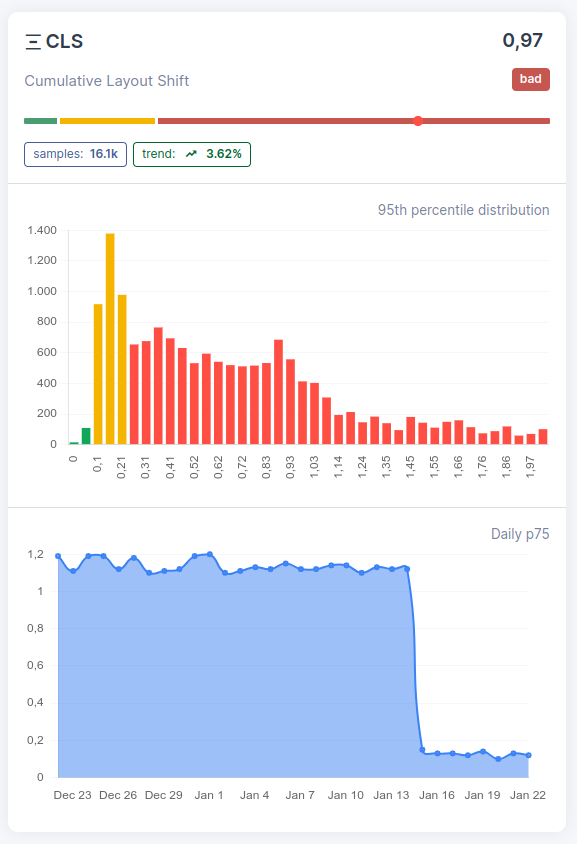
Transition 모범 사례
- 항상 정확한 속성을 지정하세요:
transition: all을 절대 사용하지 마세요. 대신transition: background-color .2s ease와 같이 작성하세요. 이렇게 하면 애니메이션을 의도하지 않은 속성으로 인한 우발적인 layout shift를 방지할 수 있습니다. - 애니메이션에 transform 및 opacity 사용: 이 두 속성은 컴포지터에서 처리되며 레이아웃을 절대 트리거하지 않습니다. 요소를 이동하려면
transform: translate()를, 시각적으로 크기를 조정하려면transform: scale()을, 페이드 효과를 주려면opacity를 사용하세요. 이는 고성능 애니메이션을 위해 Google이 권장하는 방법입니다. - 애니메이션 요소에 명시적인 크기 설정: 요소에 transition이 필요한 경우 transition 전후에 명시적인 width 및 height(또는 aspect ratio)가 있는지 확인하세요. 이렇게 하면 주변 콘텐츠가 밀리는 것을 방지할 수 있습니다. 이에 대한 자세한 내용은 자동 크기 조정 이미지로 인한 layout shift 수정을 참조하세요.
- will-change 사용 시 주의:
will-changeCSS 속성은 요소를 자체 컴포지터 레이어로 승격시켜 브라우저에 애니메이션을 준비하도록 지시합니다. 하지만 여기에는 트레이드오프가 따릅니다. 새로운 쌓임 문맥(stacking context)을 생성하고, GPU 메모리 사용량을 증가시키며, 위치가 지정된 자손(positioned descendants)을 위한 컨테이닝 블록(containing block)을 설정합니다. 애니메이션이 시작되기 직전에 JavaScript를 사용하여 동적으로 적용하고, 애니메이션이 끝나면 제거하세요.will-change를 스타일시트에 영구적으로 남겨두지 마세요.
이 모든 것에도 불구하고 2025 Web Almanac에 따르면 모바일 페이지의 40%가 여전히 합성되지 않은(non-composited) 애니메이션을 실행하고 있습니다. 좋은 소식은 CLS가 모바일에서 81%라는 가장 높은 통과율을 보이는 Core Web Vital이라는 것입니다. 나쁜 소식은 사이트가 실패하는 19%에 속한다면 CSS transition이 아직 확인하지 않은 원인일 수 있다는 것입니다.

